Priya MehtaMumbai
IdentityArkhaus Identity System
Editorial Critique
“The weight contrast between the condensed cap A and the lowercase does the heavy lifting here — it's the only place the grid breaks intentionally, and it works.”
Typography breakdowns, color theory deep-dives, and process teardowns. Every Tuesday, in your inbox.
Letterpress revival — the texture print forgot
Muted earth gradients are replacing neon
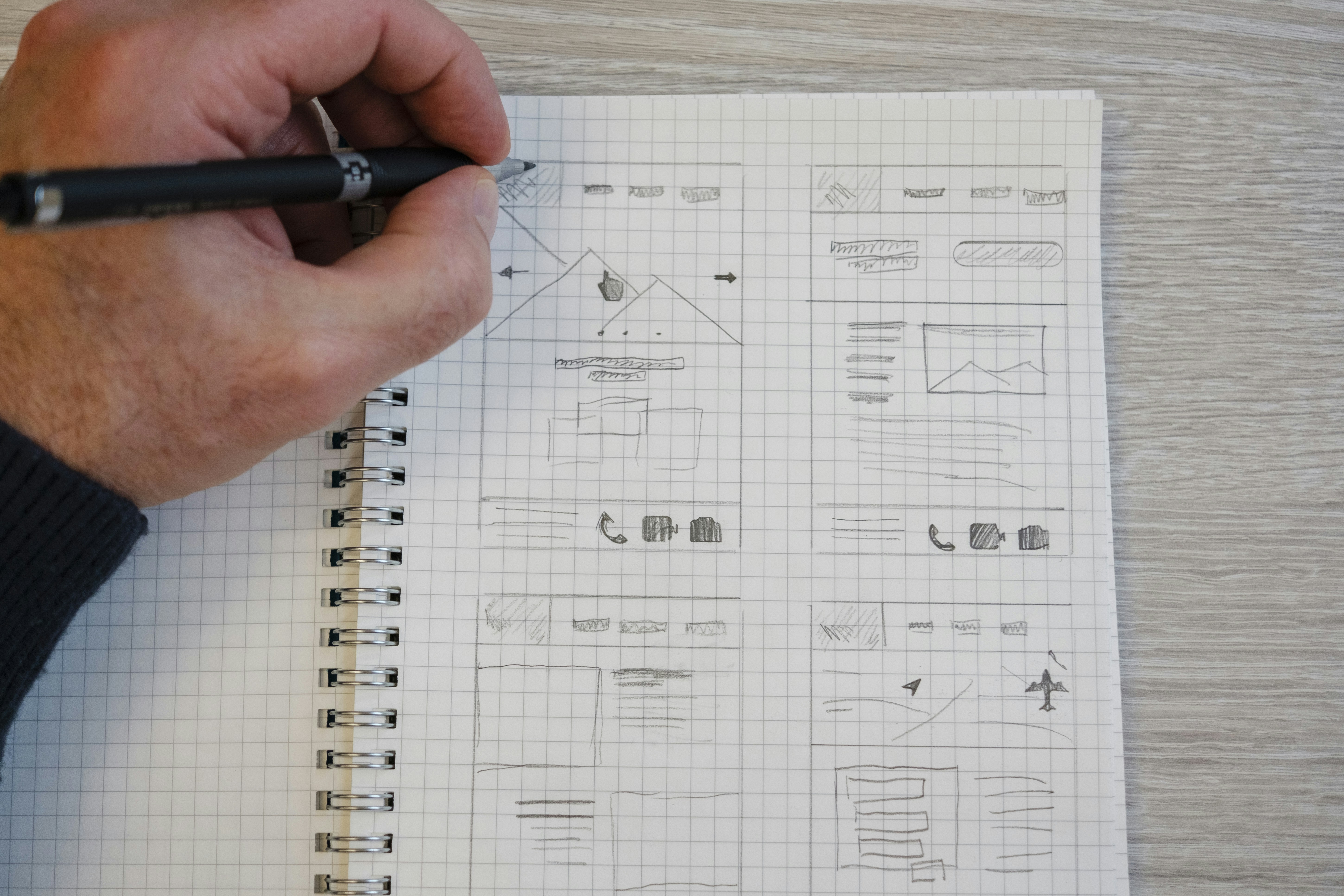
Grid sketching before Figma — still worth it
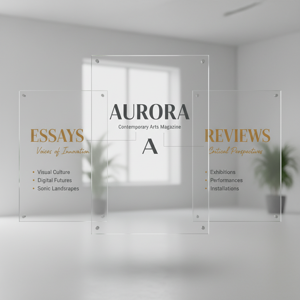
Hierarchy without size — weight alone
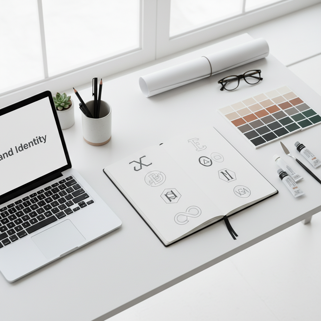
The desk as mood board
Curated every Monday night — 5 finds from the week's visual noise.
Why your kerning looks wrong even when it's mathematically correct — and the perceptual physics that explains every decision.
When we set type, we're not distributing characters — we're distributing the white space between them. Every letterform has a visual weight center optical center ≠ geometric center that doesn't correspond to its geometric midpoint. An uppercase H sits differently in space than an uppercase A, even when both occupy the same bounding box.
“The space between letters isn't empty. It's the other half of the letter.”
— Erik Spiekermann, Stop Stealing Sheep
This is why professional type designers spend weeks on a single glyph's sidebearings. The left and right margins of each character are as deliberate as the stroke itself. When you kern a headline manually Alt + ←/→ in Figma, you're not correcting the software — you're finishing the type designer's conversation.
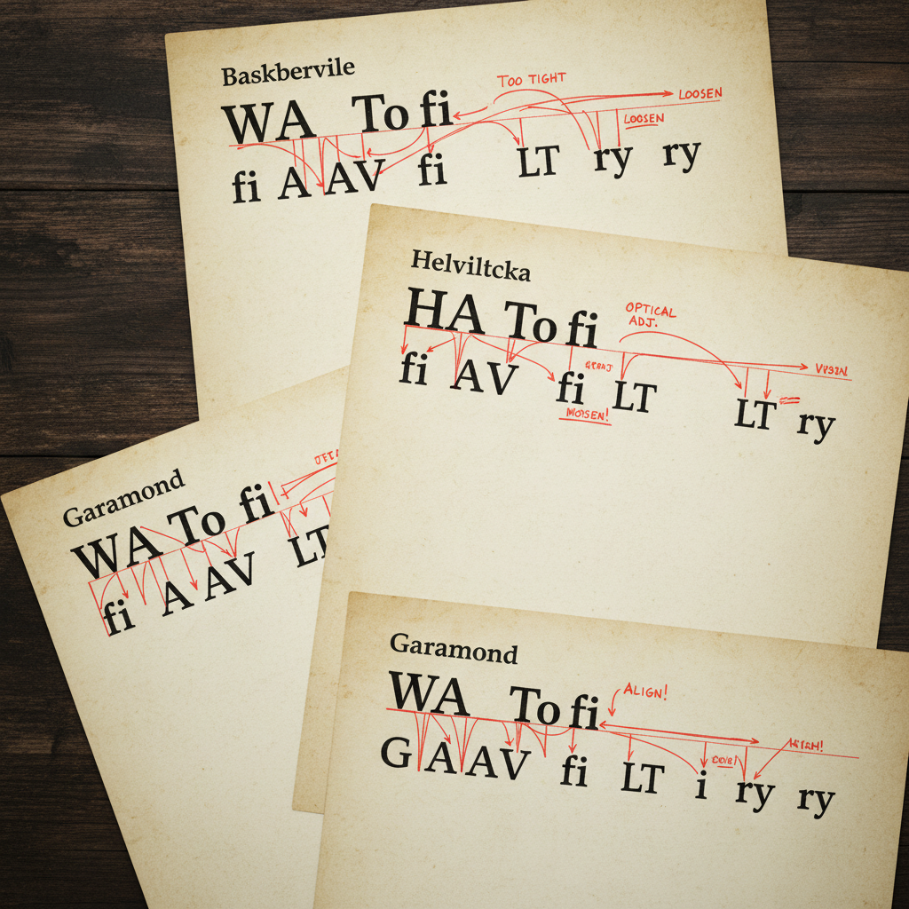
Fig. 1 — Kern pairs from the Masthead specimen archive, marked with optical correction
The three most problematic pairs in Latin type are AV, To, and VA. They're problematic not because type designers got lazy — they're problematic because their shapes create diagonal counters counter = enclosed white space that trap more visual air than their bounding boxes suggest. You feel the gap before you see it.
Join 4,200 designers who get typography breakdowns, color teardowns, and process deep-dives before their first coffee goes cold.
Also includes: Spacing Cheatsheet PDF (47 kern pairs) — Grab the free download
“The weight contrast between the condensed cap A and the lowercase does the heavy lifting here — it's the only place the grid breaks intentionally, and it works.”
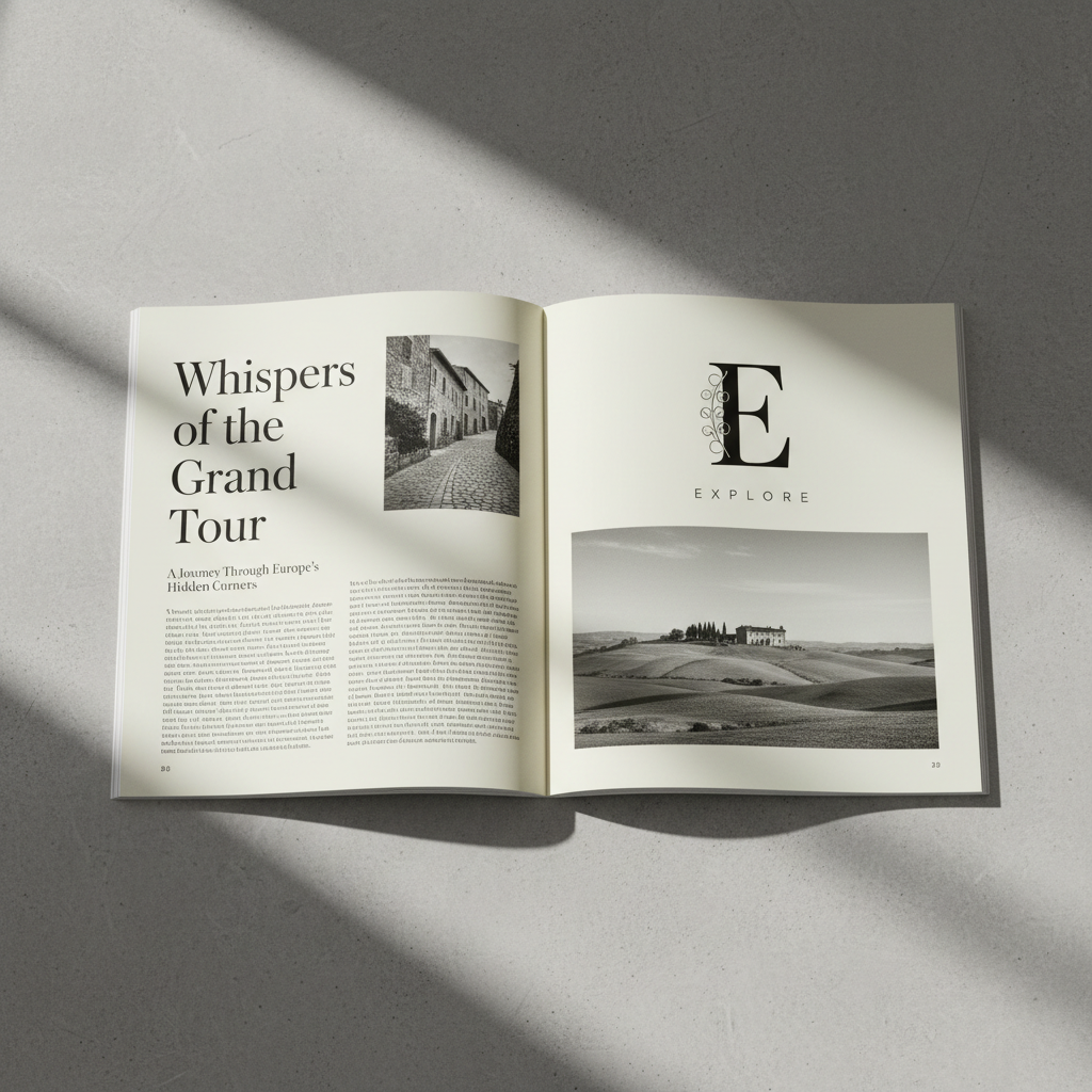
“The bleed image fighting the text column creates productive tension. Most student work avoids this discomfort. Lean into it.”
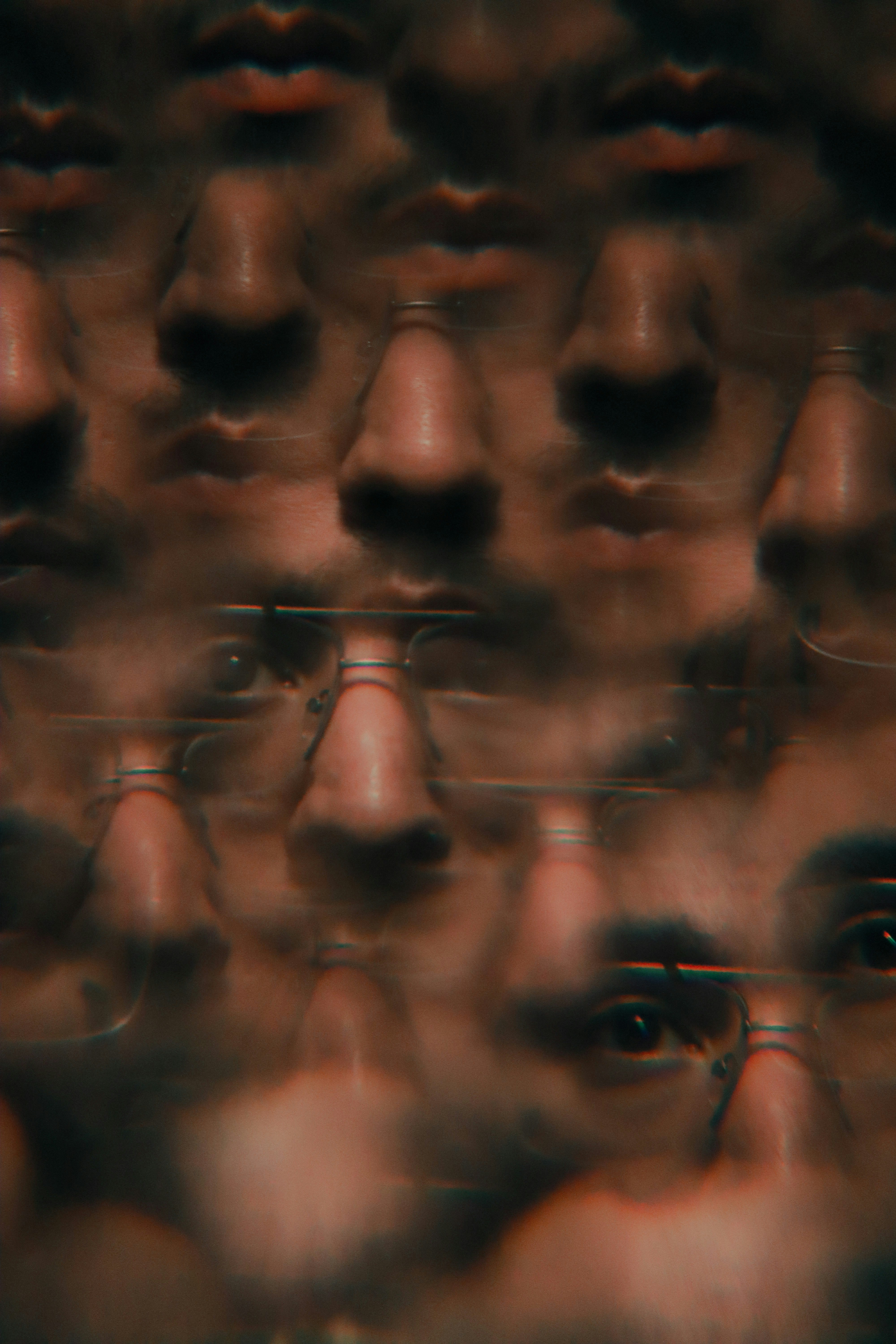
“The vertical rhythm is fighting itself in the bottom third — but the top two-thirds show real confidence. Trust it all the way down.”
Every issue features three reader submissions with editorial critique.
Submit Your WorkOptical size axis that actually behaves. The "wonky" axis is genuinely useful.
Six optical sizes. Use Cilati for headlines, Deck for subheads. Don't mix arbitrarily.
The small caps are impeccable. Rare for a text face to have this kind of optical precision.
The kerning game. Better than any tutorial for building optical intuition.
47 kern pairs, optical correction values, Figma shortcuts. This issue's free resource.
Fluid typography that interpolates across viewport. Kills the breakpoint ladder.
Pick a ratio, get a type scale. Golden ratio is overrated — try 1.333 (perfect fourth).
Gooddesignisnotdecoration.Itisthearchitectureofattention—builtonedeliberatespaceatatime.